


We have much more to do and your continued support is needed now more than ever.
25+ Digital Wildlife and Nature Maps
Visualizing wildlife and habitat data through maps presents a powerful opportunity to determine ways to help and identify trends. There is so much potential in understanding how we’re all connected through visuals like maps. We can now monitor coral reef health thanks to Google Earth and envision projects and conservation efforts in ways we’ve only dreamed of before. And while we’ve all felt that we live in a gigantic world, it’s fascinating to see how interconnected it all is.
This post compiles some helpful map sites for those of us interested in the world, wildlife and natural resources. While this is nowhere close to all of them, I’d encourage anyone to share additional sites they use or know of in the comment field.
Maps Where Wildlife and Nature are the Treasures
Mapping Life
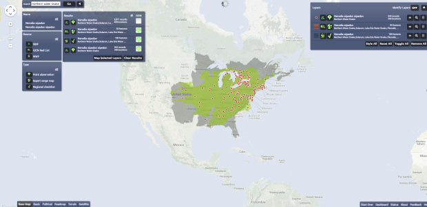
This comprehensive, global mapping tool allows you to search for species and apply layers based on submitted observations and distribution. Mapping Life pulls information from the Global Biodiversity Information Facility as well as the IUCN Red List and WWF’s wildlife finder. You can read all about this collaboration on their blog and spend hours searching your favorite species or choose to see a list of species near you.
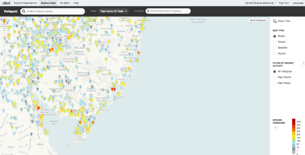
eBird Range and Submission Maps
If you love birds and want to explore visual recorded sightings of birds, this is the map for you. On the eBird site, you can toggle through hot spots (top parks and great places to spot species) and other submissions from birders. This map relies heavily on crowdsourced data. It even has a neat way to view live submissions.
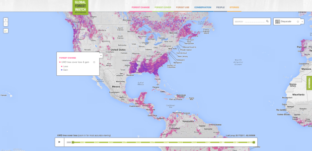
Global Forest Watch
We’ve actually already blogged about this brilliant tool—which depicts both existing forests and forest loss globally—but it’s worth a second look. Global Forest Watch is easy to use and can teach a visitor a thing or two about the world’s forests and how they are being managed.
- The National Forest Foundation has an additional helpful map that shows all of the National Forests as well as recreational uses and fire risk for the United States.
- To locate nearby parks, refuges and places to get outside there’s always NWF’s NatureFind resource. But there are of course additional resources that point you directly to National parks or nearby wildlife refuges.
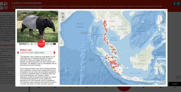
IUCN Amazing Species – This map, powered by ESRI shows a selection of animals on IUCN’s red list and organizes by concern. The list of species displays on the left hand side and will give you a glimpse at animals that we risk losing if we don’t take action.
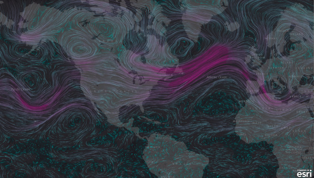
Wind Map
Wind Map is powered by ESRI and shows wind movement globally.
- For additional weather maps, you can see a wide breadth of information from the satellite activity on Intellicast’s website.
- You can also check out this informative wild fire map.
Migration and Tracker Maps (species specific)
There are a number of migration and population maps available, though few are interactive. Here are just a few that I found useful:
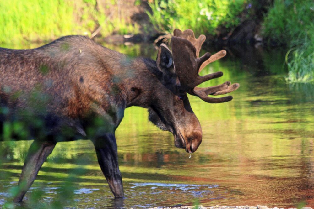
- Journey North – They have tons of maps! They vary in activity levels, but are including and not limited to; monarch butterflies, hummingbirds (several spp.) gray whales, and bald eagles.
- Geo Story – Nat Geo’s Geo Story provides an interactive way for you to track a number of animal migration routes.
- Boreal Bird Migration and Forest Maps These maps are not interactive- but depict the situation for many species of birds and how they depend on the boreal forest. There are multiple view points and they display everything from migration routes (Pictured below) to breeding grounds for select species.

- Whether you’re searching for ducks, hawks or hummingbird maps – these resources will help you figure out historical data as well as realtime updates for some of your favorite birds.
- Natureserve also has fantastic data on species distribution and even terrestrial ecosystems
WWF Species Map Tracker – if you’re interested in tracking species live, WWF has this map that follows a few animals from polar bear, narwhal, bowhead, turtle, tuna and jaguar populations.
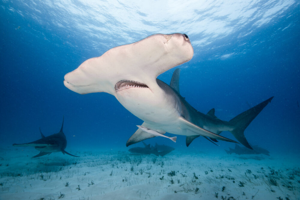
Shark Tracker allows you to follow the path of individuals from certain sharks species for the past few months. Toggle between the different species and select the individuals you want.
Polar Bear International’s Polar Bear Tracker – This map offers a chance for you to track some polar bears as they make their way around the sea ice platforms (where they hunt for seals). The map also shows the disturbing loss of sea ice over the years.
![]()
Additional Visual Resources
- Wiki Watershed – This allows you to map your watershed. Our partners over at Stroud Water Research Center helped create some visual resources in “Wiki Watershed” that make understanding the complex water issues easy to digest. Even though some of the features are regionally focused, this resource is very useful for learning about watershed runoff and additional information.
- Crucial Habitat Assessment Tools (CHAT) was put together by the Western Governors’ Association and its Wildlife Council to bring more information to the table when it came to planning around development while incorporating important wildlife areas. These maps focus on Western states and depict a neat overlay of human needs and wildlife needs. Here’s Arizona’s as an example.
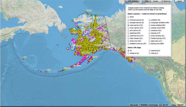
- Alaska’s Fish: The Alaska Department of Fish and Game has a map that allows you to see fish species and the streams they populate. (pictured below)
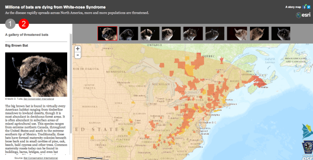
Mapping White Nose Syndrome : The map below is a good example of how we can use maps to discover more about disease and the its spread with wildlife.
Why Maps?
This post was written to curate many of the maps that include data beyond the typical geography and topography. By noticing these data points we can start to better understand our world, and as humans I think we’re always better for doing just that.
Do you know of any additional maps that should be on this list? Please share them in the comments!
